Cordova Jewelry
Learn how Cordova Jewelry reshaped its brand to create a lasting impression and amplify customer engagement.
Project Overview
Business Card
Logo Design
Website Design
Business Card
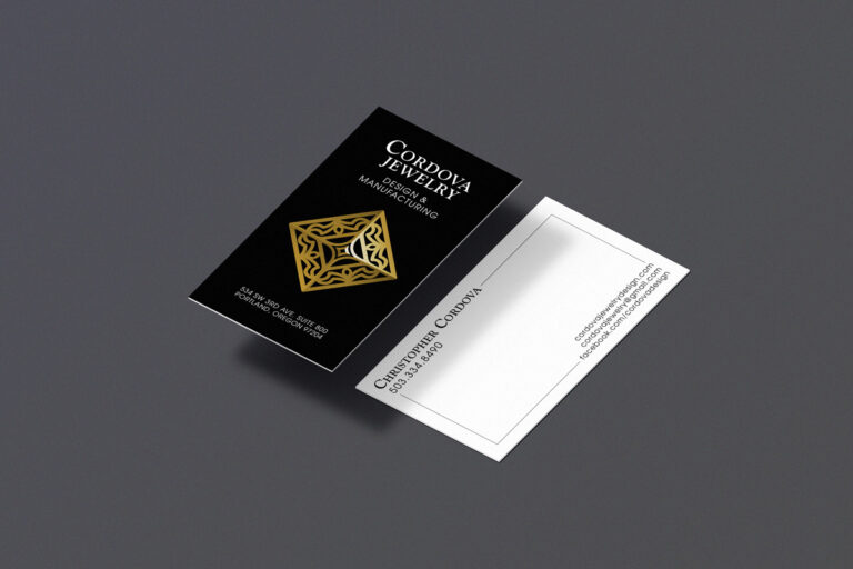
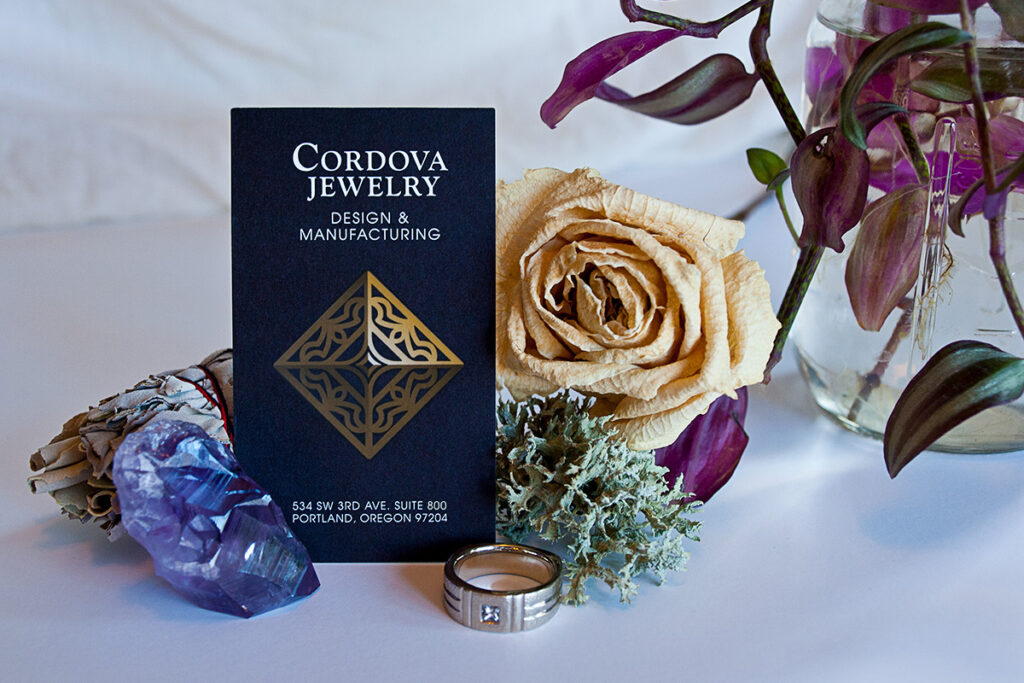
The front of the business card adopts a sleek vertical orientation, stacking elements to establish a clear visual hierarchy that enhances balance and symmetry throughout the design. A bold black background is the perfect backdrop, allowing the logo to stand out prominently and leave a lasting impression.
On the back, a clean, open space is intentionally designed for handwritten notes or sketches, offering a personal touch during face-to-face meetings with potential customers and adding an interactive element to the card that fosters connection and engagement.
Logo Design
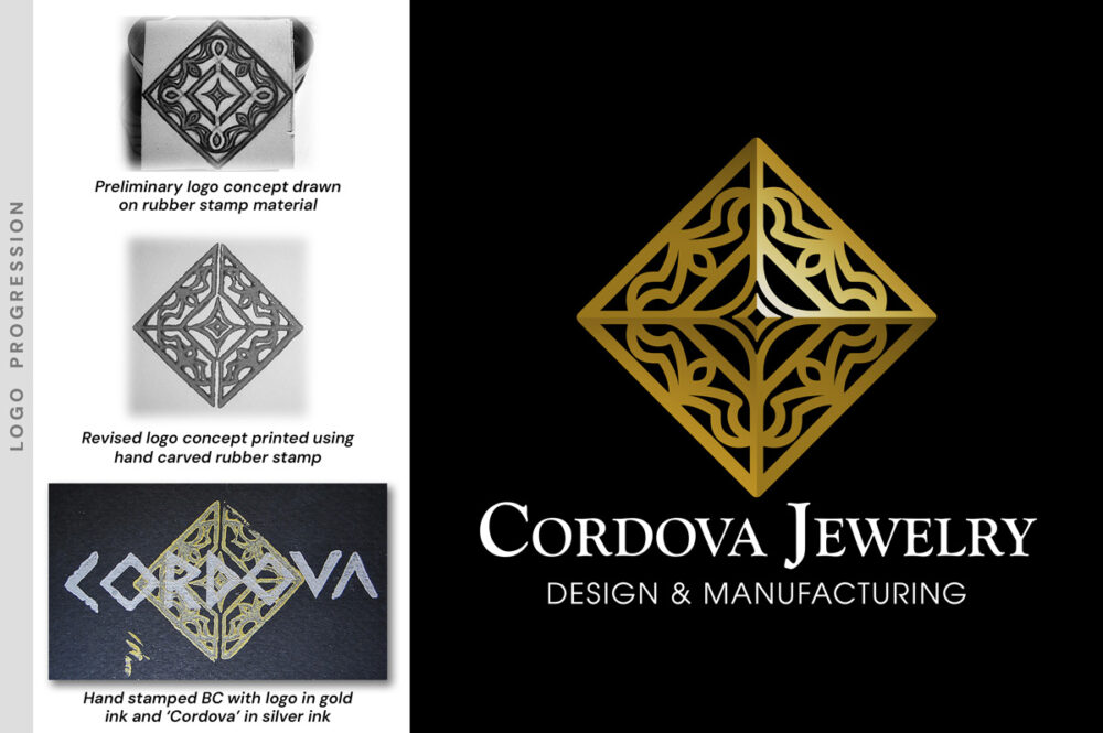
The logo draws inspiration from the intricate, pyramid-like formations in natural diamonds, symbolizing strength and timeless beauty. The design uses a sophisticated blend of gradient overlays, creating a distinctive three-dimensional effect that adds depth and elegance.
This thoughtful approach reflects the precision of diamond craftsmanship and gives the logo a modern, polished appearance that resonates with Cordova Jewelry’s unique aesthetic.
Website Design
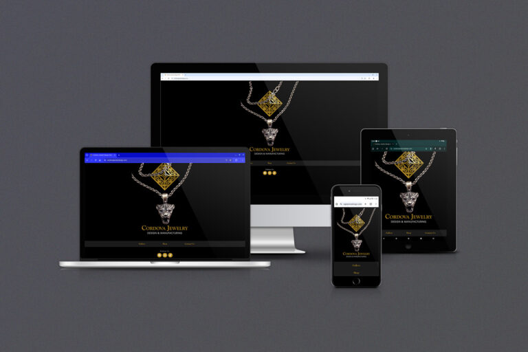
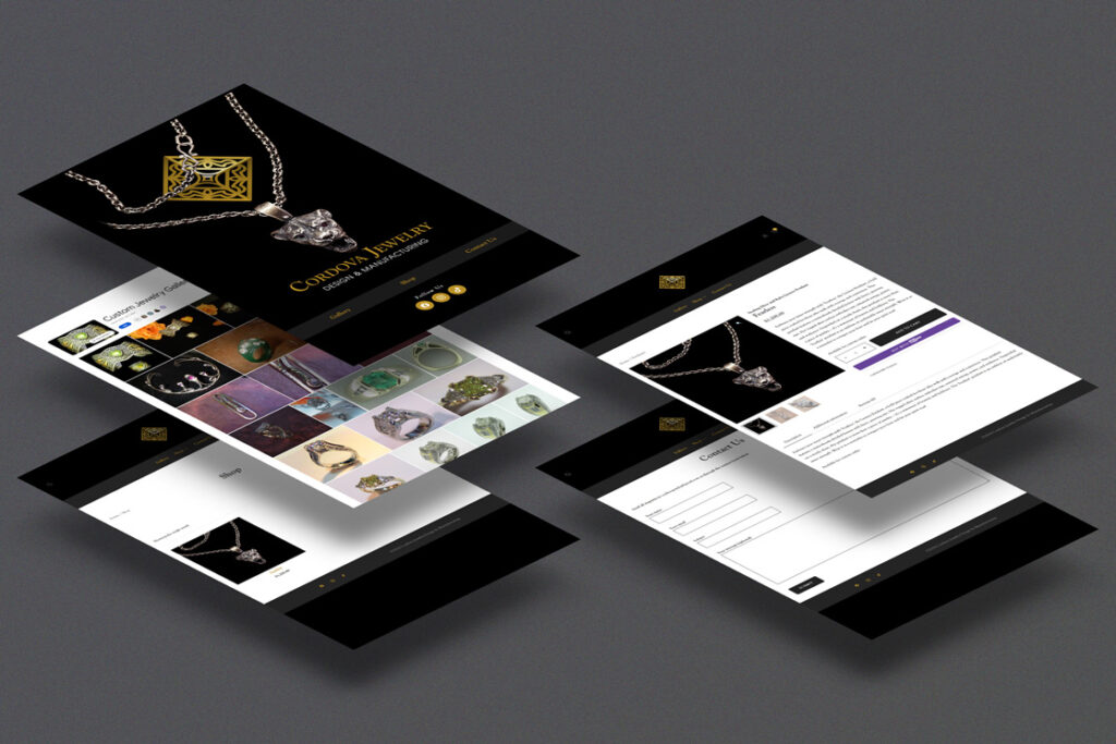
The previous website lacked essential e-commerce functionality and a gallery for showcasing the latest jewelry pieces limiting the client’s reach and ability to engage customers. I introduced an e-commerce page allowing seamless online shopping, making Cordova Jewelry’s offerings more accessible to a wider audience.
A Google Photos album gallery was also integrated to ensure customers could view a high-quality, up-to-date catalog of recent work. The homepage features a distinctive hero section that creatively combines the brand’s logo with a recent jewelry piece.
Explore More Projects
Every project tells a story — see how I help clients transform their ideas into successful designs that truly work.
©2026 Jacob Cordova Design


